Andy Glidden from Glidden Design & Brand Communications explains the creative process behind the development of the Brightwater brand
Creating the right visual brand identity for a new company is crucial when engaging with today’s increasingly sophisticated consumers.
Not only does your company need to stand out from its competition but it also needs to resonate with its target consumers and of course be memorable.
Brightwater CEO, Roger Green has launched many successful companies over a career spanning thirty years and he knew just how important it would be to create the right look and feel for his new water venture which he was setting up with Rich Rankin, Brightwater’s MD.
Powerful branding is more than just creating a logo
Roger had worked with Andy Glidden from Glidden Design on previous branding projects so he and his Edinburgh-based team were the first choice when it came to creating a brand identity for the new company.
Andy explains: “Rich and Roger approached us in October 2015 to ask us to develop the branding for their new water retail business. They had spotted an opportunity with the deregulation of the water market to set up a new style of water supplier that would offer a service providing cheaper water to business customers. Roger’s brief to us was simple; ‘be disruptive’.
Laying the foundations of the identity for a new business is not an easy task but our experience has taught us that the best solution is derived from the client’s actual circumstances, their core values and aspirations in order to be believable and genuine.
At that point the business didn’t have a name so the first thing we did was open a folder titled ‘Water Co.’. We undertook a naming exercise to develop options for what the new business could be called and during the process we came up with the idea that when choosing your water utility company you need to make the ‘bright’ choice, inferring ‘intelligence’ and a play on the word ‘right’ – and so ‘Brightwater’ was born. Rich had been able to purchase the brightwater.com domain name so the foundations were laid.
Our next step was to look at the competing water retail companies in Scotland and across the UK to analyse their identities and understand how we could differentiate Brightwater and make it really stand out from the crowd. Brightwater’s Managing Director Rich Rankin, who has a background in internet marketing, also talked to us about the personality he wanted to associate Brightwater with and the need to communicate the core values of being ‘trustworthy,’ ‘professional’ and ‘friendly’.
Colour plays a very important role in shaping a brand identity and the obvious colour for a water company is blue, although we initially explored other colours, including one option which was predominantly vivid orange. Ultimately, however, we decided to use as primary colours dark blue as the staging colour and a very striking yellow for the name ‘Brightwater’ to really ‘zing’ out. Dark blue and yellow are so far away from each other on the colour spectrum that they work really well together. We also use a teal green as a secondary colour, which we feel makes for a very distinctive palette, especially when sitting next to the competitors in the water retail market.
Powerful branding is more than just creating a logo, however – we also took into account typography, images, shape, form, tactile qualities and tone of voice; these are all part of the process of creating a strong brand identity Font choice and case selection is an important consideration as using lowercase letters communicates that you are friendly and approachable and allows you to develop a shape for your name that is more easily recognisable than using all capital letters, which can appear less characterful and occasionally a little ‘shouty’. Design is also about emotion, you want to tap into a customer’s emotional triggers to get them more fully engaged with your business.
Creating the right visual brand identity for a new company is crucial when engaging with today’s increasingly sophisticated consumers
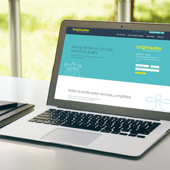
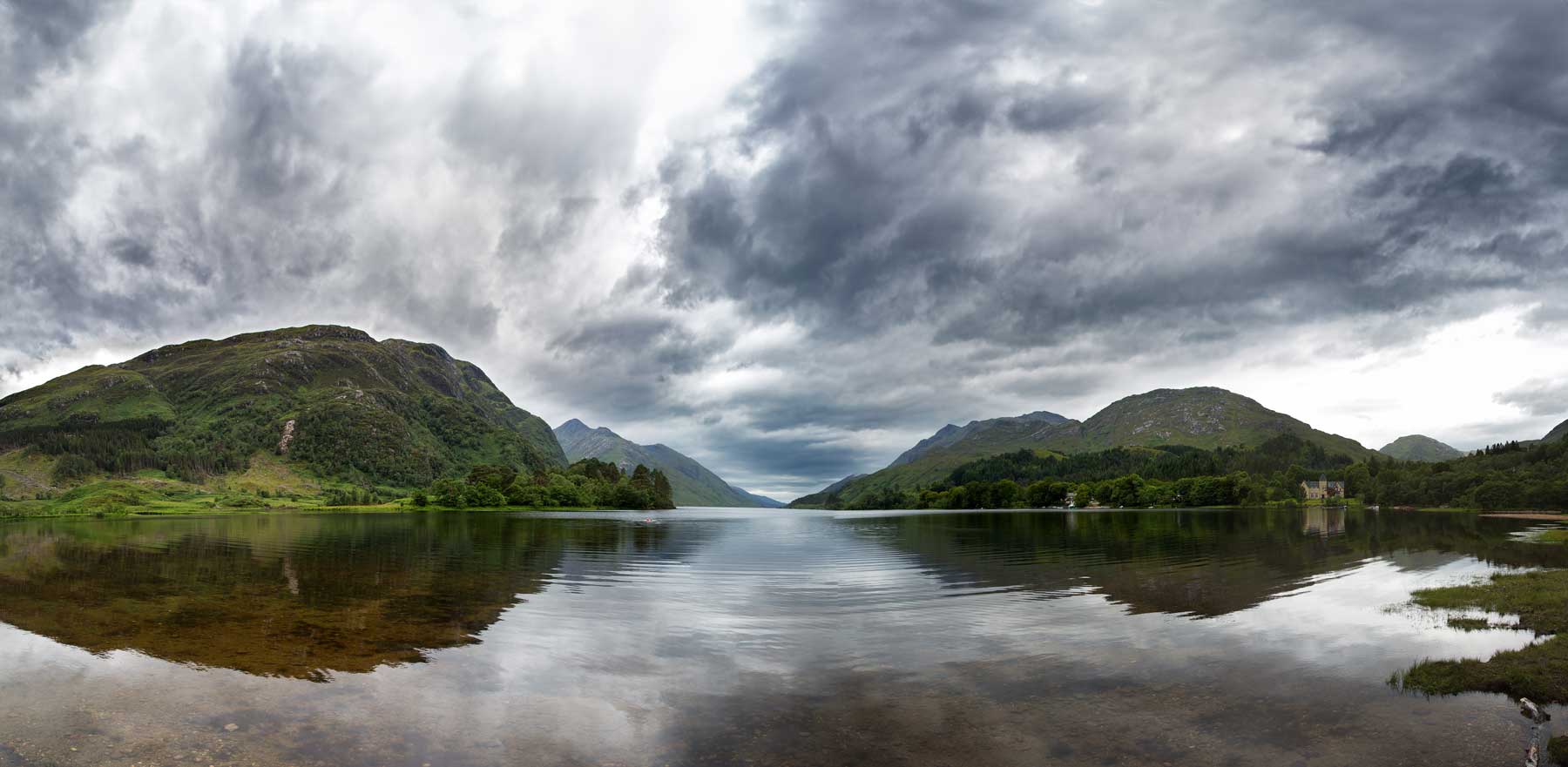
We deliberately chose not to use any water symbols as a logo element, however, the visual identity system for the brand does include a water droplet graphic which can be used as a supporting element in a more free manner to suit the application. Part of the brief was to create Brightwater’s website and it gave us the opportunity to really show off the brand and present Brightwater as a credible company in the water retail market while supporting its positioning of being a professional yet friendly organisation. We used big hits of yellow and line drawings of quirky elements as a mechanism by which to introduce more informal fun elements. We also provided supporting photographic images to give the brand a strong human element.
Our aim was to build recognition amongst Brightwater’s target customers to ensure that the brand would be top of mind and present them as the trusted provider in the water retail market with the end result that Brightwater would become one of Scotland’s leading companies in the water industry. With the success the company has enjoyed over its first 15 months of trading; contracts worth over £1.6 million a year and 1100 customers, we are confident that Brightwater is on its way to achieving its goals. We can take satisfaction in the fact that the brand identity we created for the company is contributing to its success.”
Brightwater launched its first marketing campaign this month (September 2017) using the original design concept created by Glidden Design. The campaign features a series of print and digital adverts that have appeared in The Herald, Scotsman and Business Insider and use the strapline ‘A water company that cares about its customers. How refreshing!’


